Sometimes, the smallest changes tell the biggest stories.
Recently, Microsoft introduced a refresh of Microsoft 365 icons, and at first glance, it may seem like just a visual update. But when you look a little deeper, it actually reflects a much bigger shift happening across the entire ecosystem.
Why icons even matter
It’s easy to overlook icons.
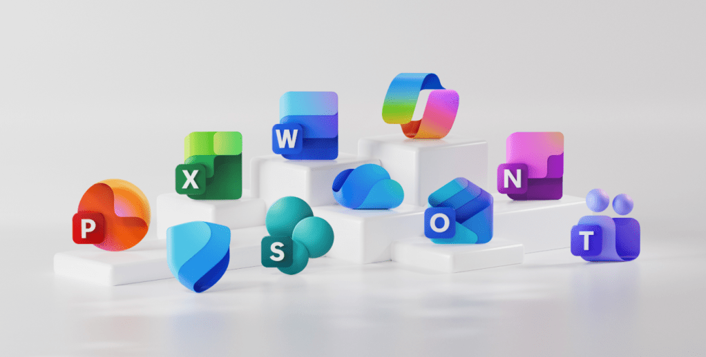
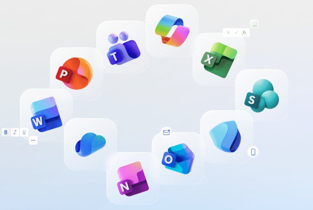
They’re small, simple, and we see them every day. But in reality, they are entry points to entire experiences—Word, Excel, Teams, Outlook—all starting from a tiny visual.
Microsoft describes them as something that:
- represent complex capabilities
- guide users intuitively
- create emotional connection with products
And honestly, that’s true. Most of us recognize these icons instantly without even reading the name.
From “tools” to “intent”
What really stood out to me is how Microsoft is shifting its thinking.
Earlier, design was focused on:
- consistency
- interface
- visual alignment across apps
Now, it’s moving toward something deeper:
understanding user intent and helping you move seamlessly across apps
This is where Copilot and AI play a huge role.
Instead of jumping between apps manually, the experience is becoming more connected—where the system understands what you’re trying to do and helps you get there faster.
The design shift – subtle but meaningful
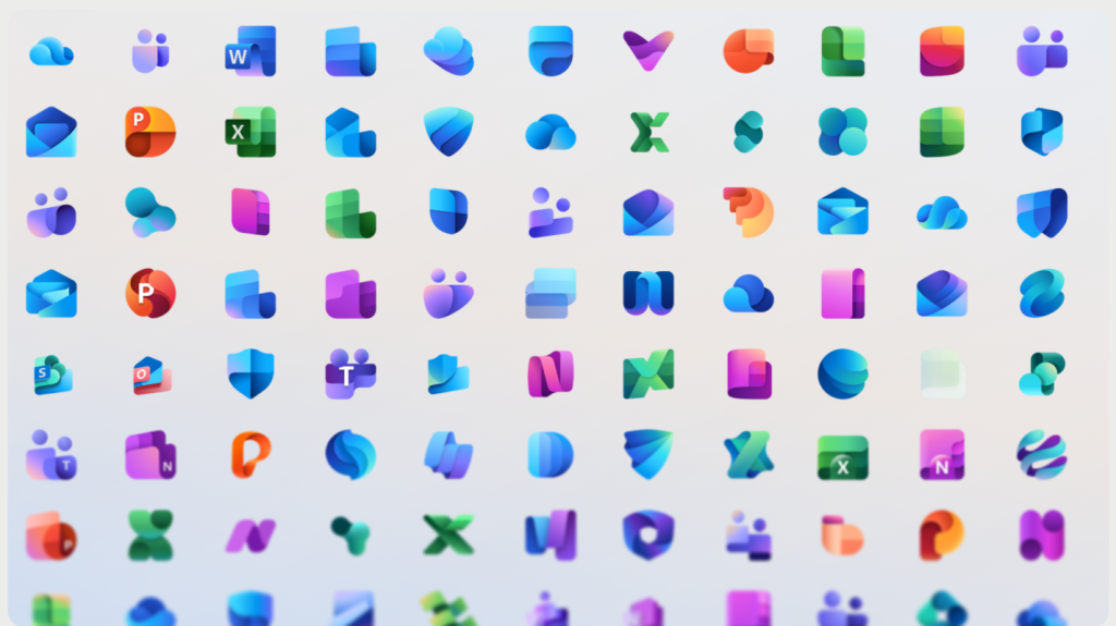
The new icons bring a few noticeable changes:
🔹 Simpler and cleaner
Less visual noise, easier to recognize—even at smaller sizes.
🔹 More fluid shapes
Moving away from rigid, boxy designs to something softer and more dynamic.
🔹 Richer colors
More vibrant gradients that feel modern and alive.
🔹 Still familiar
Even with changes, the core identity is still there—which is important.
Microsoft calls this approach:
“evolution, not revolution”
And that makes sense—you don’t want users to feel lost, but you still want to move forward.
What this actually means for us
This isn’t just about icons.
It reflects a bigger shift in how products are built:
- Continuous updates instead of big, occasional changes
- AI becoming part of everyday workflows
- Experiences becoming more connected across tools
In simple terms:
It’s no longer about individual apps—it’s about a unified experience.
My take
What I found interesting is how design is now closely tied to how we work with AI.
The icons are just the surface.
Behind them is a move toward:
- smarter workflows
- better collaboration
- systems that understand context
And that’s where things get exciting.
Final thought
A small icon change might not seem like a big deal.
But sometimes, it’s a signal.
A signal that:
- products are evolving
- experiences are becoming more intelligent
- and the way we interact with technology is changing
And this is just one of those moments.

Leave a comment